Finding New Exploits with A Bespoke Model
Detecting Exploit Code
Everyone knows that various people will post their proof-of-concept exploits onto GitHub. We definitely know there is correlation between observed exploitation activity and exploits being published so it’s good to track and monitor what’s out there. But with countless repositories built around vulnerabilities, it’d be expensive and time consuming (and still contain mistakes) to manually inspect every single one of those to determine if they contain exploit code, non-exploiting scanning code or any of the other valid reasons for vulnerability related repos to appear (patch code, saving the vulnerable code for later testing, deep analysis of the vuln, and so on).
We recently revisited our GitHub Exploit classifier and we spent a lot more time and energy evaluating model performance then building the models. The question wasn’t “why do we need another repository score?” it was “can we produce a better score?” The answer was a rather clear yes.
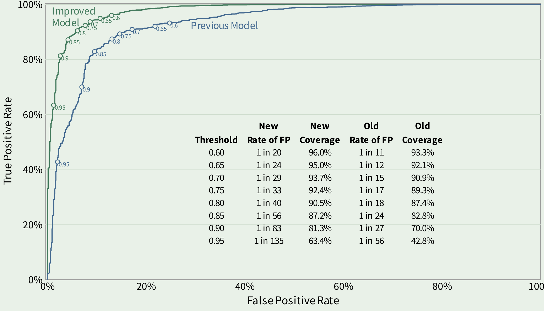
Comparison of performance between the previous classifier and the new and improved classifier.
Notice the performance of the previous/old model in blue and the new and improved model in green. In this plot we would like the line to push to the upper left (which is where the new model is going).
What’s different?
In order to improve this model we put our effort towards improving the observable attributes of exploit code. We explored the data and tried to visualize and establish which observations were more (or less) likely to be associated with a github repository that contains exploitation code. Turns out many exploit repositories don’t spend a lot of time updating, in other words, commits on exploit code are generally much lower than other types of repositories. And generally there is not a lot of variety in the files (with a few different ways to measure that variety). Basically, we found improvement in this model by letting the algorithm observe more attributes about the code, file system, commits and the history.
How much better is the new model?
It’s a little hard to look at the two lines in the above plot and internalize how much the new model improves over the previous model. Visually, there is separation between the two and the new model moves that line in the right direction, but so what? What does that mean in practice? The table helps put some numbers to the improvement and I show two different metrics in the inset table for the previous and new models: “Coverage” and “Rate of False Positives”.
Let’s break those numbers out at several different thresholds. Thresholds are necessary here because the predictions come as a continuous value between 0 and 1. The higher the number, the more likely the model considers the repository to have exploit code.
Coverage is the proportion of repositories with exploit code over the selected threshold. For example, at a threshold of 0.90 the coverage in the new model is 81.3%. Meaning if you labelled all of the repositories above 0.9 as exploit code, you would capture around 81% of the repositories with exploit code.
Rate of false positives is the proportion of repositories that are above the threshold (labeled as exploit code), but in reality, do not contain exploit code. In the example with a threshold set at 0.9, the false positive rate is about 1 in 83, meaning out of every 83 repositories we thought contained exploit code only about one was incorrect.